Back

Mailplane 4

Mac App
Redesign

Mailplane project img

Company

Mailplane GmbH


Team

  • Engineer
  • Designer

My Scope

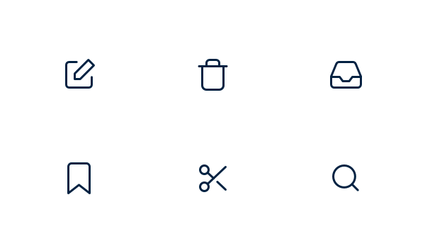
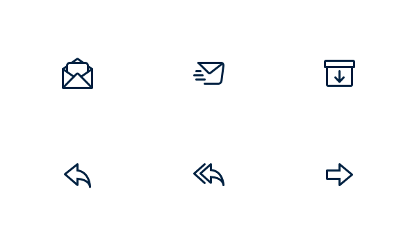
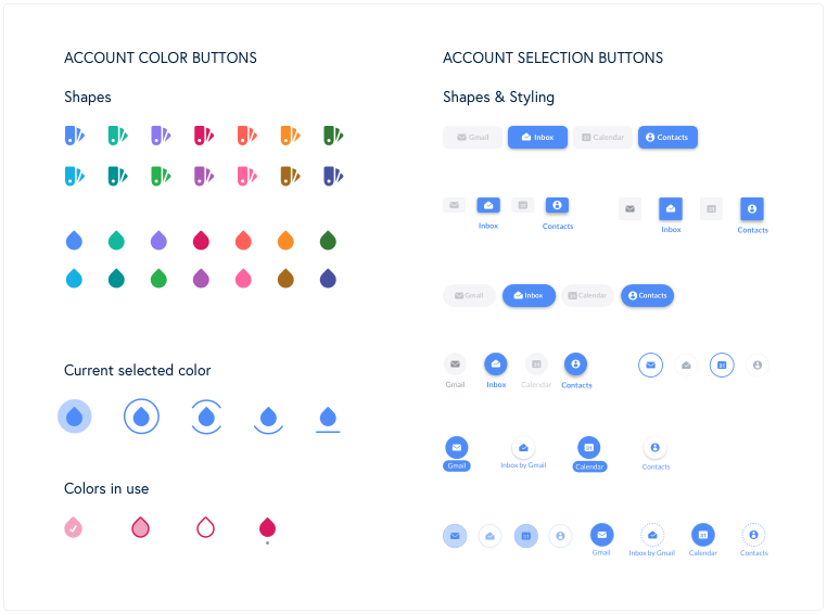
  • UI Design (first sketches to final designs)
  • Creation of animations and icons
  • Building Prototypes
  • UX Design support
  • Design QA and some general testing

Link

Mailplaneapp.com

About Mailplane

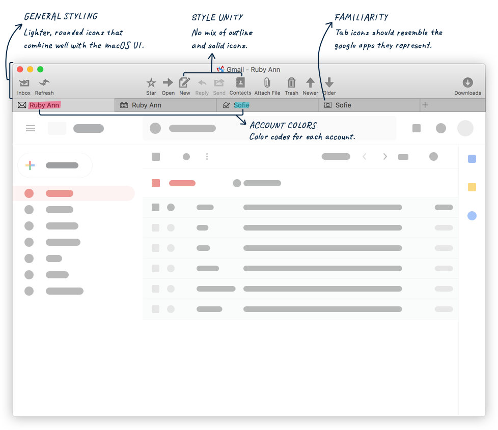
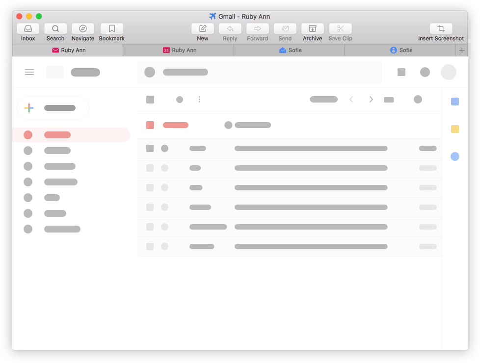
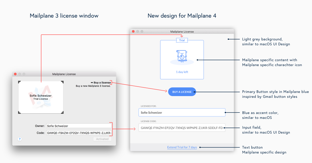
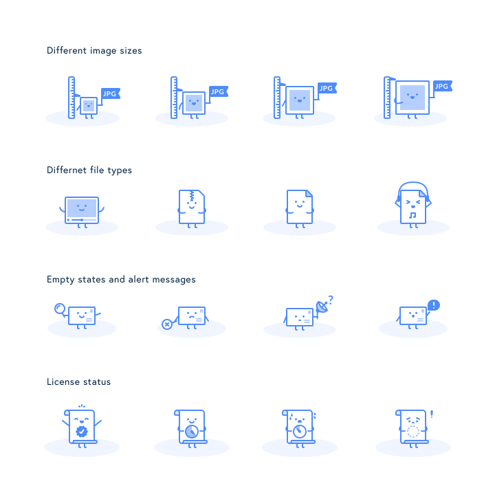
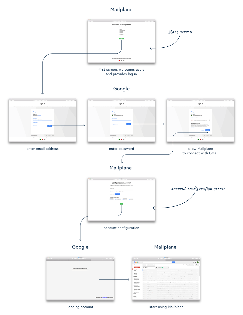
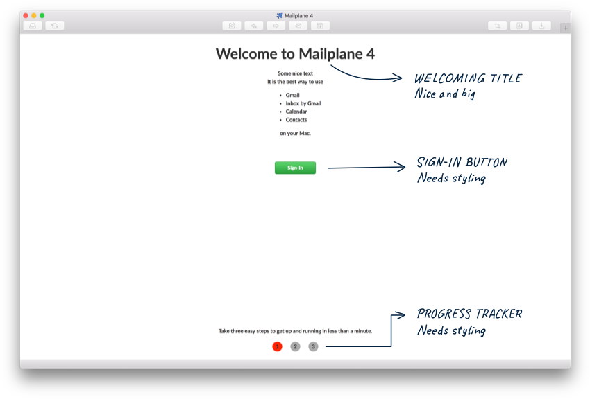
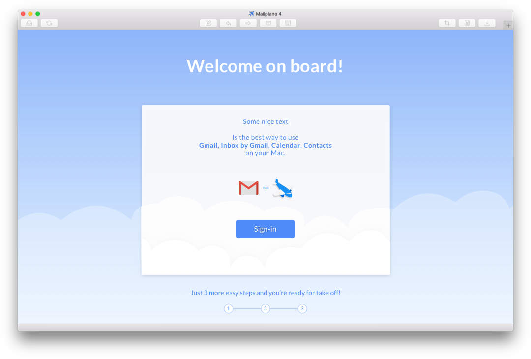
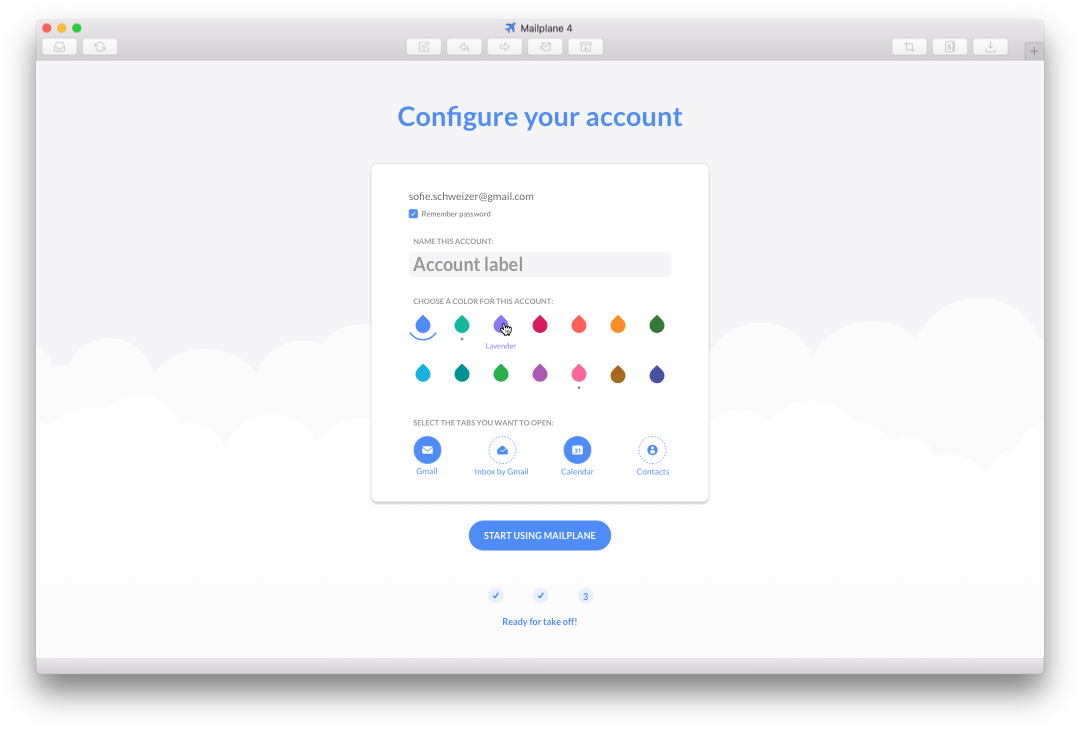
Mailplane is a mac desktop app for Gmail, Google Calendar, Google Contacts and Inbox. It makes it easy to use an unlimited number of accounts organised and tidy within one app instead of a tab-cluttered browser window. In addition to that it provides notifications for new emails, a search across all accounts, image annotations, third-party extensions and a lot of useful shortcuts. With Version 4, Mailplane went through a major update which also included a redesign.
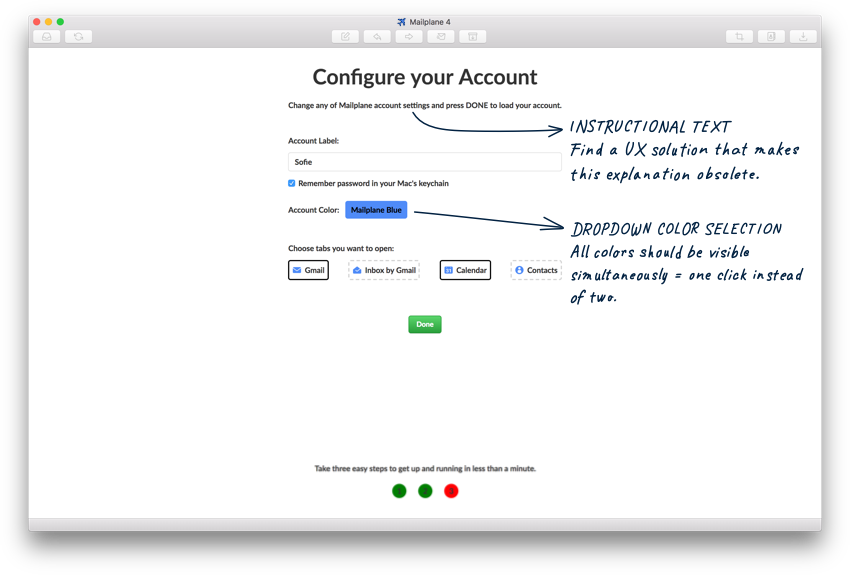
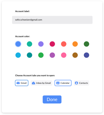


Requirements

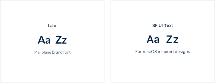
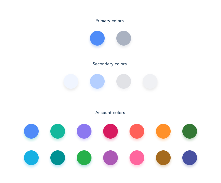
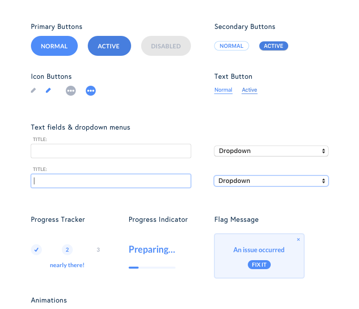
  • Create a design language that works with macOS UI elements, the G-Suite environment and Mailplane's own specific features.
  • The App should stay familiar to existing users.


Design Goals

  • Streamline and modernize the existing UI
  • Improve user experience
  • Create a basic style guide for reusable components

Intro

This case study shows my design process and my thoughts, behind the redesign of Mailplane 4. As the whole project became quite extensive in the end, I restricted myself to the following five topics which I hope give a good insight about the work I did.

1 App icon redesign

2 Toolbar and tab redesign

3 Window design

4 UI style guide

5 Onboarding design

1

Text ornament

App Icon redesign

We decided to start the project with a redesign of the app icon. Mailplane 4 was going to be the biggest update since the app's initial launch 10 years ago and with a new app icon we could convey this at first glance. In addition to that, we wanted to have a softer and simpler looking icon. The present one with its 3D style was a bit out of date and did not match the macOS design language anymore. As representation for the app we wanted to keep the combination of a plane and an envelope. Based on that I drafted two possible routes with design proposals.

App icon img
App icon before the redesign

Route 1

App icon route 1
Streamlined version of the existing icon

Route 2

App icon route 2
New design ideas

Selection

After evaluating both routes we decided to go with number 1. Even with this major update, Mailplane 4 will still be the same product in its core concept. Route 1 captured this idea nicely by being a better version of itself and not something completely new. Based on this design, I started to iterate on the icon's appearance and optimised all the details that weren't convincing yet.

Plane evolution
Iterations on the plane's wings and turbines.

Final App Icon

Final app icon
Different sizes and a different design for the smallest size
128px | 64px | 32px | 16px

2

Text ornament

Toolbar and Tabs redesign

Pleased with the new app icon, it was time to take on the app's UI. First task: the redesign of the toolbar, toolbar icons and tabs.

Toolbar and tab design
Evaluation of the existing toolbar and tab design

Icon style

Until this point the toolbar icons were a bit a random mix of style and size. I wanted them to become uniform and closer to the macOS UI design. In order of efficiency we decided to work with an existing icon set. Missing ones we would create form scratch. I researched for sets that matched my style requirements and found the feather icons. They have a light and soft style, are carefully built and work very well in small sizes. They also provided more than half of all the icons we needed for the toolbar.


Feather toolbar icon examples
A selection of feather icons we used for the toolbar...
Mailplane specific toolbar icons
...and some missing ones I created in the same style .

Tab icons

For the tab icons I needed 4 designs which resemble their corresponding google app icons. They should also work in different colors so we can use them to color-code the tabs by account. In this case the feather icons couldn’t provide a match as there were no icons close to the official ones from Google. On top of that they only come in an outline style version which does not provide enough surface to represent different colors properly. Therefore I decided to design them myself.

Gmail icon exploration
Inbox icon exploration
Contacts icon exploration
Calendar icon exploration
Iterations to find the best representation for each icon
Final tab icons
Final four icons
Gmail | Inbox | Contacts | Calendar

New Design

Final toolbar and tab design
Final design. New toolbar icons with macOS button style and tab design with color-coded icons.

3

Text ornament

Window design

As Mailplane only consists in parts of native building blocks, there were several UI components that needed a design which normally would be predetermined by the macOS AppKit. For several windows we needed a complete body design including UI components like buttons, input fields and labels.

The license window was one of those. It includes informations about the current license type (trial version or one of three payed versions), a button to buy or upgrade the license and two input fields for the owner's name and license number. For all those components we needed a design. My goal was to create a look close to the native windows but also to leave room for Mailplane specific designs when necessary. On top of that I wanted to improve the UX as well. For example the button to buy a license was quite unobtrusive in Mailplane 3. I wanted to change that with Mailplane 4 and gave it an unmistakable button shape, introduced an accent color and placed it much more prominently within the window.

License window
Mailplane 3 vs. Mailplane 4

4

Text ornament

UI style guide

Based on those first designs I was able to create a basic style guideline which came in very handy for the further course of the project.

Typeface

Typeface img

Colors

Mailplane colors

UI Components

Mailplane UI components
Loader animation
Loader
Counter animation
Email counter
New message animation
New message

Character icons

Character icons

5

Text decoration

Onboarding

One of the more extensive chapters was the design of the onboarding process. I was very excited about it from the start, as it seemingly offered a lot of room for creativity and uniqueness. As the basis for my design exploration, I received a roughly implemented version of the general flow by the developer. On one hand this was great, as clicking through it, helped to understand the overall concept and see what already worked and what could be improved. On the flip side, it immediately influenced my thinking and put an image into my head of how it could look and feel like. Therefore, I wasn't sure if I would still be able to come up with the creative and unique idea I initially aspired to.

Being kind of stuck on the creative side, I decided to choose a more analytical approach. Instead of thinking how amazing this should become, I focused on what was already there. I divided the onboarding into individual steps, by counting every time the whole UI changes, as a separat screen. With this method, I ended up with 6 screens in total. By arranging them in order, I got a static representation of the whole user flow, which helped capture everything at a glance.

Onboarding flow in single screens

Onboarding flow

As a result of that arrangement, I realised that 4 of those 6 screens will be hosting contend coming from google. Three for the google account login flow and one for a loading indicator. For those 4 screens I primarily needed a background theme to connect them with the rest. Google's login mask should stay as it is, to be familiar to users and therefore receive their trust. The remaining two screens were for Mailplane specific content. The start screen and the account configuration screen. Those two would be my priority for now.

Start screen

Start image
Evaluation

Additional design elements we need

First rough sketch

Start screen first sketch
Mock-up of my first sketch for the start screen

What I liked in this first sketch


What did not work for me yet

Next step: use animation

I’m always interested in finding a way to explain things with as little words as necessary. In this case I thought it would be nice to visualise how the combination of Mailplane with the Google apps generate this symbiotic and improved product. To better communicate this idea I created an animation, that shows how the plane and the envelope merge to create the Mailplane experience.

Onboarding animation
First try, neat something like this could work!

Try it out with the whole flow

I liked the idea of the animation and wanted to try it in context with the whole flow. I matched the size of the card with the size of the google log-in UI to have a consistent area in which all the main actions happen and sketched up a draft containg all the onboarding steps.

Prototype of the onboarding flow.
So far so good.

Taking on the account configuration screen

I was quite happy with the way the whole flow felt. Of course it was still a draft and needed more love. I started with more detailed design work by styling the account configuration screen next.

Account configuration screenshot
Evaluation

As I already sketched a first version of the account settings for the prototype, I started from there.

Account configuration first sketch
First Sketch for the account configurations

Iteration on buttons

I wasn't happy with the design of the account color buttons and their hover and active state and I also wanted a different styling for the account selection buttons.

Button design
Iteration on account color buttons and account selection buttons

For the final design I changed the sky form blue to a light grey. This way it looked less playful and it helped to increase the focus towards the main content. I also looked into font styling and defined a custom input field.

Account configuration final design

Final onboarding

Based on the design for the account configuration, I adjusted the rest of the screens. I also suggested to animate the clouds in the background, to make them look like they're passing by the window of an airplane. Furthermore, I applied the new style to the rest of the Mailplane UI.

Onboarding flow and tab management

Final words

Thank you for reading. I hope you enjoyed it and I was able to give some valuable insights into my design process. If you are interested, how I adapted the Mailplane UI for mac Mojave dark mode, then I invite you to read the following article I've written on Medium.

Back to overview